Use Flow Layout Panels and Panels to Design Responsive Layout
As an application designer you can use a combination of panels and flow layout panels, which are widget containers, to design analytic applications that can adapt to different screen sizes.
About Panels and Flow Layout Panels
You can use a panel or flow layout panel as a container to group any type of widgets together, so that when a panel is moved, copied, deleted, shown, or hidden, all the widgets in the panel will follow it. In addition, you can nest one panel or flow layout panel inside another.
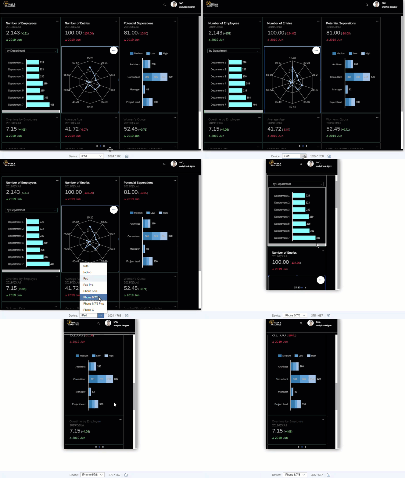
Compared with common panel, flow layout panel can provide responsive layout. For example, if a screen size is too small to fit two widgets in one row, then the widget on the right will flow to the next row automatically.
Widgets that are set to invisible at runtime don’t take up any space inside a flow layout panel.

Inside each flow layout panel, a widget's width and height (either in pixel or percentage) are respected, but its position (left, right, top or bottom) will be automatically adjusted to the screen size.
To be more specific:
-
If a widget’s width is set as static, such as pixel, the widget will flow to the next row if the screen size is too small for it to fit in.
-
If a widget’s width is set to percentage (recommended for mobile), when the screen size gets smaller, the widget’s size will shrink as well by its percentage until its minimal width is reached. After that it will flow to the next row.
Layout APIs such as setLeft, setTop, setRight and setBottom won’t take effect in flow layout panels.
You can drag and drop any widget to the panel or flow layout panel directly on the canvas or Outline. For flow
layout panels, you can multi-select widgets and then from  (More Actions) select Group in Flow Layout Panel to place them all at once. You can
also set the width or height of all the selected widgets to percentage from the menu.
To let application users show or hide a panel or flow layout panel, you can leverage the script APIs isVisible() and setVisible(). For detailed information, refer to Analytics Designer API Reference.
Configure Responsive Rules
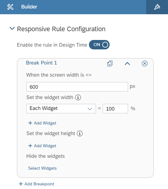
You can also configure responsive rules in the Builder panel of a flow layout panel by setting break points.
There you can define how the width and height of certain widgets will be adjusted as well as which widgets to be hidden in runtime when the screen width is smaller than a certain threshold.

Design Responsive Layout
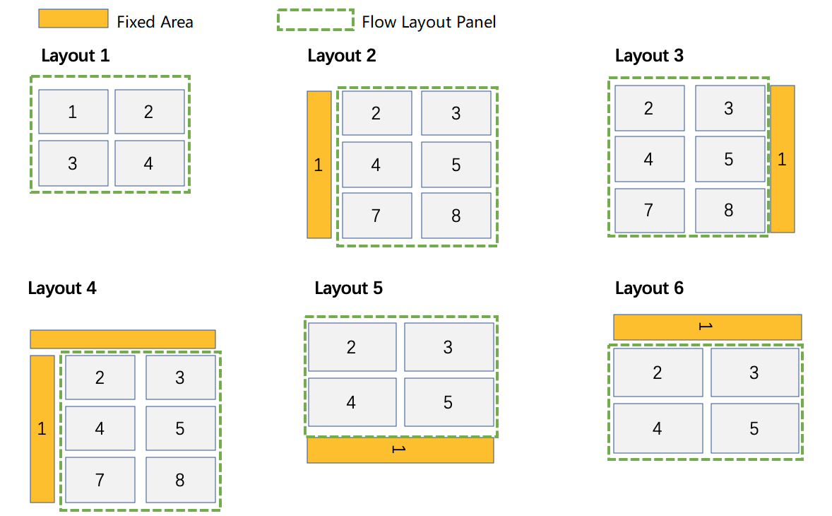
You have the flexibility to keep some contents at a fixed position and others in responsive layout, such as always leaving a header on the top or a navigation panel on the right of the application.
You only need to place a flow layout panel and widgets in fixed area side by side, such as the following typical layouts of analytic applications:

Besides, you can nest common panels in a flow layout panel to create more sophisticated layouts.