Design Responsive Layout (Optimized Story Experience)
As a story designer, you can use responsive pages and define responsive rules to design stories that can adapt to different screen sizes.
Prerequisites
To design a story that can adapt to different screen sizes, use responsive pages. If you're creating a responsive story from scratch,
on the  Stories start page, under Create New choose Responsive. Then,
select Optimized Design Experience as the design mode.
Stories start page, under Create New choose Responsive. Then,
select Optimized Design Experience as the design mode.
Context
-
Configure responsive rules for different devices, including custom ones.
The rules cascade down from larger to smaller devices, and you can activate rules for specific devices to override.
For phones, there's a default responsive rule, where widgets are placed sequentially and each occupies the full width of the screen. You can further customize the rule.
-
Set widgets' position, size and visibility, so that they can be automatically adjusted to different screen sizes.
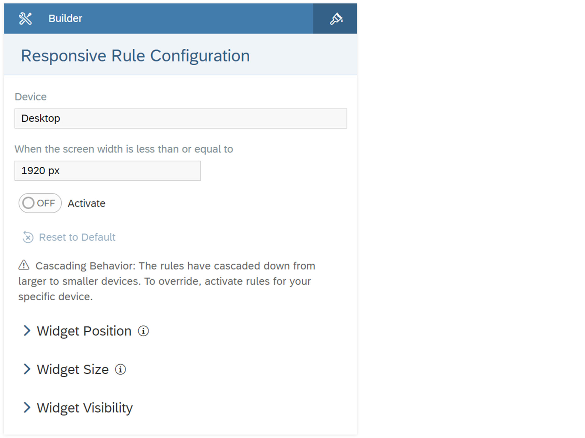
- Freely position widgets.
- Auto-flow widgets by horizontal or vertical priority.
- Overlap widgets, for example, a button over a chart.
- Have a live preview in edit time of how your story looks like on different devices.Note
For iOS and Android phones and tablets, device preview doesn't include the view time toolbar, so the preview and actual view might be different. When designing your stories, take account of the vertical space of the toolbar, so that they fit into these devices.
On responsive pages, widgets can be grouped by lanes, and you can configure the responsive rule for each lane. Widgets in the same lane stay
together when the responsive page is resized. To add a lane, from  (More Actions) select
  Add Lane, and then select Add Lane to Left, Add Lane to Right,
Add Lane Above or Add Lane Below.
Add Lane, and then select Add Lane to Left, Add Lane to Right,
Add Lane Above or Add Lane Below.
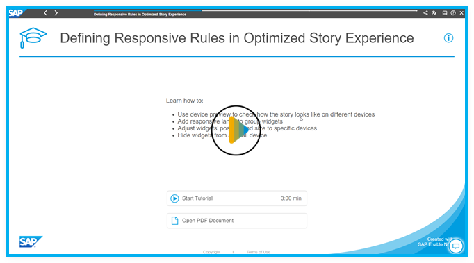
Learning Tutorial
Click through the interactive tutorial illustrating how to define responsive rules in step-by-step instructions (3:00 min); the tutorial is captioned exclusively in English:
Procedure
-
Set the widget position in either of the following ways:
-
Free: You can freely move and position the widgets in the lane. Widgets stay in a specific position, irrespective of others and device type.
You can also determine the space allowances on widgets' top or left:- Under Set the space on top or Set the space on left, select Add Widget.
-
From the dropdown list, select Each Widget or a specific widget.
The setting for a specific widget overwrites the one for each widget.
-
Specify the grid spaces:
- For the space on top, enter an integer between 0 and 200.
- For the space on left, enter an integer between 0 and 35.
TipIn responsive rule configuration, widgets' size and position are specified by grid. Therefore, showing the grid makes it more convenient for you to do the settings. Under the dropdown list of your page, select Page Styling, and then in the Styling panel of the page, select Show Grid.
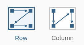
Auto-Flow: Widgets are positioned sequentially, based on Row or Column.
You can also select widgets to remove from auto-flow and set the space on its top and left so that they can be freely positioned to a specific place.
A combination of free positioning and auto-flow is helpful when most widgets need to displayed one by one on smaller devices like mobile phone, while some always stay in a specific position regardless of screen size, such as your branding image.
-
Results
You can configure responsive rules for more devices to make your story adapt to different devices. The device preview bar lets you select any device to have a live preview in edit time of how your story looks like and adjust your rule configuration accordingly.
In view time, the widgets are resized, repositioned or hidden when the screen reaches or is no greater than certain width, according to the responsive rule you've configured.
Unsupported APIs for Responsive Lanes
- setLeft, getLeft
- setRight, getRight
- setTop, getTop
- setBottom, getBottom
- Page.moveWidget