Modify Axes on Single or Dual Axis Charts
In SAP Analytics Cloud, you can change the axis range of a chart or you can synchronize axes on a dual-axis chart.
Set Axis Ranges Manually or Dynamically
By default, charts include the zero axis even if there are no values close to zero. This can leave a lot of white space in your chart.
To minimize whitespace, you can manually set ranges for your values, or you can let the system dynamically set the minimum and maximum values.
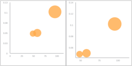
The bubble chart Y and X axis intersect at 0, but your data starts at 50 million on one axis and 0.05 million on the other. Even with scaling, there is still some unused space near the intersection. By changing the axis minimum value, you can eliminate more of that empty space.
You can set the axis range for multiple chart types.
| Manual or Dynamic | Chart Type |
|---|---|
|
Manual only |
Bar/Column Stacked Area Stacked Bar/Column Waterfall Box Plot |
|
Manual or dynamic |
Combination Stacked Column & Line Combination Column & Line Line Bubble Scatterplot |
How to Manually Set the Axis Range
-
Choose your chart.
-
Choose

 (More Actions)
  Edit Axis
 .Tip
.TipIf you don't see the Edit Axis option in the first menu level, then select
More Options Edit Axis. -
Enter your minimum and maximum values.
-
Choose Apply.
To reset the chart back to the default axis values, in the Edit
Axis dialog, for each axis select  (Reset to
auto).
(Reset to
auto).
How to Dynamically Set the Axis Range
-
Choose your chart.
-
Choose
(More
Actions) Edit Axis.TipIf you don't see the Edit Axis option in the first menu level, then select
More Options Edit Axis. -
Find the toggle for Dynamically Set Min/Max and set it to On.
If your chart has more than one min/max toggle available, set the toggle for each axis.
-
Choose Apply.
Synchronize Axes in a Dual-Axis Chart
When you have charts that have measures on two different axes (for example, a Line chart or a Combination Column & Line chart) and those measures are of different scales, the data can be confusing. You can synchronize the chart scaling so that the measures are on the same scale.
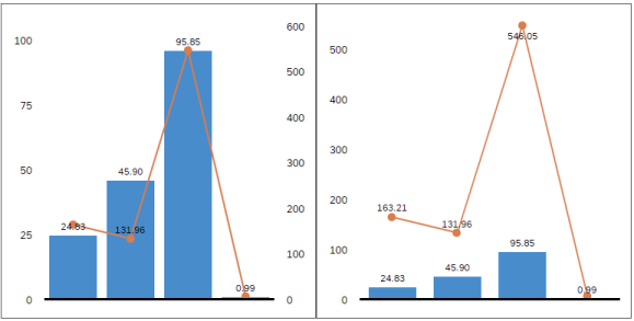
Your gross margin or left axis scale goes to 100 million, but the sales price or right axis scale goes to 600 million.
When you synchronize the axes, you can clearly see the values for each measure.
How to Synchronize Chart Axes
-
Choose your chart.
-
Choose
(More Actions) Edit Axis.TipIf you don't see the Edit Axis option in the first menu level, then select
More Options Edit Axis. -
Find the toggle for Synchronize Axes of Dual Axis Charts and set it to On.
-
Choose Apply.