Customize Your Themes Using CSS (Optimized Story Experience)
You can define multiple CSS classes either as global default or for individual widget, popup or page, which brings more flexibility to the
styling in your stories. The styling settings conform to CSS standards and are no longer limited to the existing ones provided in the styling
panel or theme preferences.

Note
To use CSS, ensure that you have the permission Create for the object type Theme.
Define and Apply CSS
You can define CSS in the CSS editor and apply it to individual widgets, popups, pages or the whole story.
Procedure
-
To open the CSS editor, do either of the following:
-
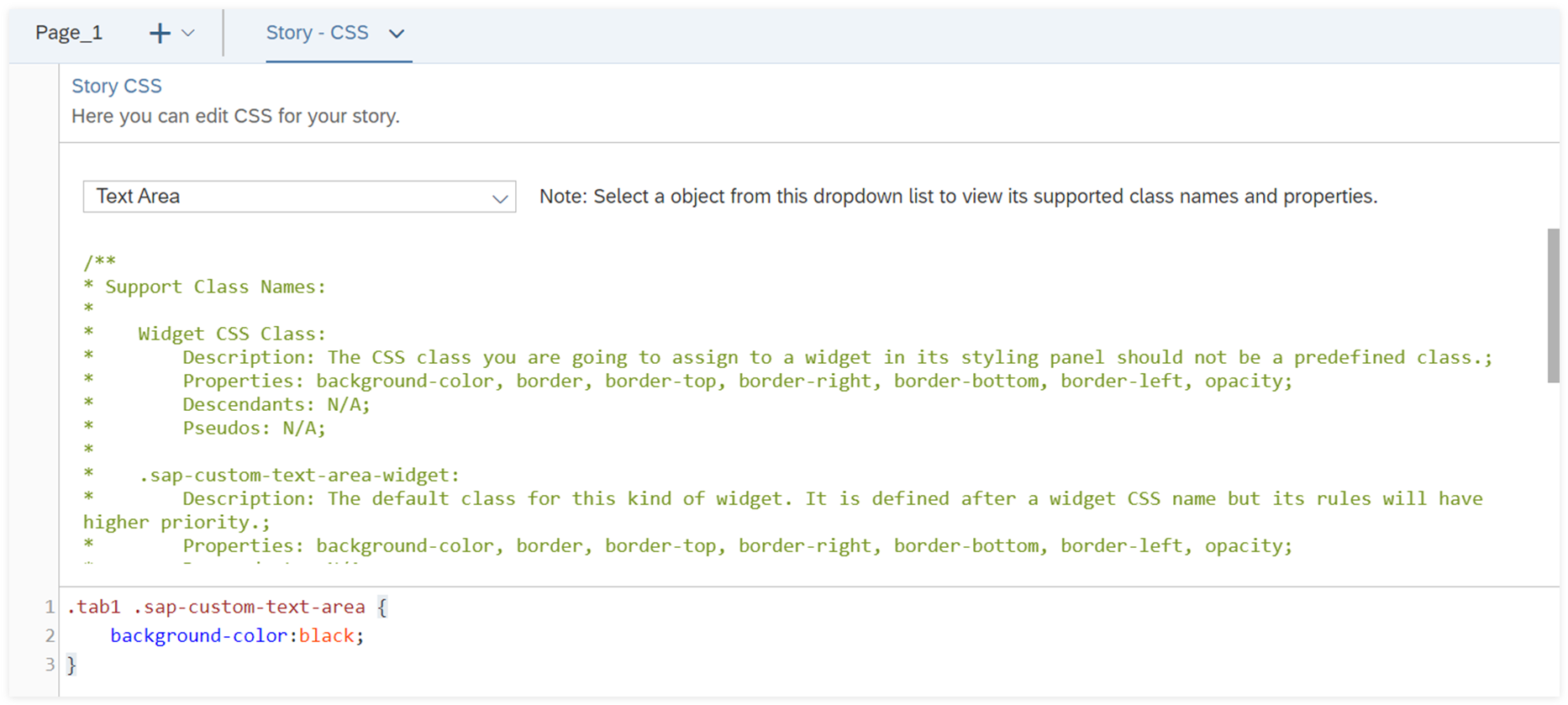
In the upper section of the editor, you can select a widget type, Popup or Page
from the dropdown to view all its supported class names and properties.
-
In the lower section, write CSS.
It's usually composed of a custom class name, element selector, property and value.
Sample Code
.my-theme-1 .sap-custom-button:hover {
	background-color: #00ff00;
	border-color: #0000ff;
}
/**
* In this example, my-theme-1 is a custom class name, sap-custom-button is an element selector and :hover is a pseudo.
* !important syntax is NOT supported.

*/
Note
For a custom class name:
-
When it's defined alone, only two properties are allowed: background-color and
border.
-
You can’t directly add pseudos to it.
-
It must be listed first. For example, element selector sac-custom-radio-btn-group-row must
not be listed before custom class name my-theme-1.
For an element selector, it comes from the supported classes shown in the editor.
-
Apply the CSS class you defined in the CSS editor to individual widgets, popups, pages or the whole story:
-
To set the CSS class for a specific page, popup or widget, go to its Styling panel. For example,
you’ve defined CSS class named my-button-1 for button-specific settings. Under Generic
Properties, you just need to enter my-button-1 for CSS Class
Name. Then the button applies the corresponding CSS settings.
-
To set the CSS class as the story’s default CSS class, select  Global Settings from Outline, and enter the custom class name under
Global Default Class Name.
Then, all widgets, popups and pages in the story apply the corresponding CSS settings.
After defining a global CSS class, you can load it into the theme currently used by the story to make it the default
appearance first. To do this, go to  (Theme) under Format in the toolbar, and select the theme your story
is using. In Theme Preferences switch on Enable Theme CSS, and enter the
custom class name under Global Default Class Name. Choose Save and
Apply. Later story designers or developers can still enter another global CSS class is entered in
Global Settings to overwrite your default settings.
Note
When both individual and global default CSS classes are defined, the former overwrites the latter one.
Results
In edit time, you can see that your story immediately applies the styling after you've defined and assigned the CSS class.
Later to let viewers set CSS, you can use script APIs such as setCssClass() and getCssClass(). For more
information, see Optimized Story Experience API
Reference.
Load CSS into Theme
You can load CSS into any existing theme, which can be reused across stories. The CSS settings overwrite the existing theme and settings
in the Styling panel of any widget, popup or page.
Procedure
-
From the Format section of the toolbar, select
 (Theme). Hover over the theme you want to modify,
and choose
  (Preferences)
to the right of it to open Theme Preferences.
-
In the General section, switch on Enable Theme CSS.
-
Choose Load Story CSS.
You can see that all the CSS classes you've defined in the CSS editor appear below.
-
Choose Save to save the theme with CSS or Save As to save a new theme.
Results
The CSS settings have become part of the theme that can be reused across stories. If you modify CSS and want to
load the latest CSS, select
Reload Story CSS in
Theme Preferences.
Note
The priority of styling methods from highest to lowest is: widget styling defined in the CSS editor, widget styling from theme
CSS, widget styling defined in the styling panel and widget styling defined in the theme preferences.

 (
(
 (
( (
(