The Density Curves
Understand how the positive targets and the negative targets are distributed in your predictive model.
The Density curves display the density function of the score (probability that an observation belongs to each class) for positive and negative targets.
The estimated density function in an interval is equal to:
(Number of observations in the interval/Total number of observation)/ Length of the interval.
The length of an interval is its upper bound minus its lower bound.
The X axis shows the score and the Y axis shows the density.
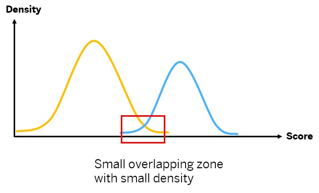
- The blue curve, Positives: This curve displays the distribution of population with positive target value per score value.
- The yellow curve, Negatives: This curve displays the distribution of population with negative target value per score value.
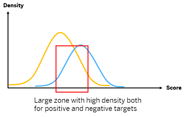
As an example, check the density curves below. The first example is a good model because there is a small overlapping zone with low density. This means the predictive model is pretty good at separating the positive and negative cases. Whereas in the second example, you see a large zone with high density for both positive and negative cases.
The fewer observations there are and the smaller the score interval for the overlap zone, the better it is.

