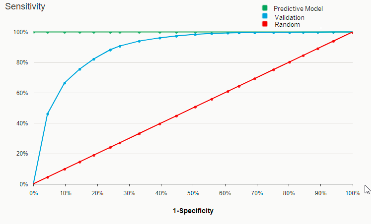
The Sensitivity Curve (ROC)
See how your classification model handles the compromise between sensitivity and specificity.
This curve shows the True Positive rate against the False Positive rate as the detection
threshold is varied:
- The X Axis shows the [1-Specificity]. It represents the proportion of actual negative targets that have been predicted positive (False Positive targets).
- The Y Axis show the Sensitivity. It represents the proportion of actual positive targets that have been correctly predicted (True Positive targets).
Each point on the curve represents a Sensitivity/[1-Specificity] pair corresponding to a particular threshold, so the closer the curve is to the upper left corner, the higher the overall accuracy of the predictive model.
Example
Take the following Sensitivity Curve: 
At 40% of False Positive
targets (observations incorrectly assigned to the negative target) we see the
following:
- A random predictive model (that is, no predictive model) would classify 40% of the positive targets correctly as True Positive.
- A perfect predictive model would classify 100% of the positive targets as True Positive.
- The predictive model created by Smart Predict (the validation curve) would classify 96% of the positive targets as True Positive.