Story Pages
You can add multiple pages to your story to help you explore and present your data.
A story page can be a blank canvas, a responsive page, or a grid. Use a blank canvas or responsive pages to lay out tables and charts, or use a grid to work with numbers and formulas on a sheet. Responsive pages let you create lanes to section the page content into groups. Tiles within a lane stay together when the responsive page is resized.
On the page tab bar, you can select a page's drop-down menu to delete, duplicate, rename, move, hide, or add comments to that page. You can also copy and paste story pages from one story to another.
When you copy or duplicate a story page, the input controls (measure, dimension, and cross-calculation) won't be copied to the new page.
To move a page, you can drag and drop the tab to the desired location, or from the drop-down menu, select Move left or Move right to move the page one level in either direction.
Hiding a page makes it visible only to users that have edit rights; it is not visible in present mode. To hide a page, from the page's drop-down menu, select Set as hidden. You can tell if a page has been set as hidden because its name is struck-through. To make a hidden page visible, from the page's drop-down menu, select Set as visible.
Responsive Pages (Classic Story Experience)
Responsive Pages: Previewing Responsive Pages on Different Devices
You can preview a responsive page to see how it looks on different screen sizes and device types.
The preview screen shows an approximation of how the widgets will appear, but it won't be an exact match to how the widgets actually appear on a specific mobile device.
In some cases, widgets resize and flow to fit smaller resolution screens when space becomes limited. However, if the screen that you're previewing is larger than the screen you're working on (for example, trying to preview a 4K UHD device on a laptop monitor), then the preview may show the widgets very small, possibly too small to be readable. On the appropriate device, the widgets will be the correct size.
- From the story toolbar, select .
- Select the Device and the Size.
Responsive Pages: Setting Fonts for Different Screen Sizes
Because text fonts can appear too small or too large on different screen sizes, you can set the font size for each screen size.
- From the preview screen, select a Device and a Size.
- Select the Designer.
The Styling menu appears when you're in Designer mode.
- Decide whether to resize the fonts for the page or for specific widgets:
-
Select the page: this will change the font size for any widgets that haven't already had their fonts changed.
Type the percentage or use the Font Scale slider to select a percentage. (If you use the slider, the change takes effect after you release the slider.)
-
Select a widget: use the Text Selection list to choose which text in the widget you want to resize, and then either type a percentage or use the Font Scale slider to select a percentage.
-
To leave the preview screen, in the toolbar select  (Device Preview).
Responsive Lanes
You can use responsive lanes to section the content of a responsive page into groups. Tiles within a responsive lane stay together when the responsive page is resized.
By default, a responsive page starts with two lanes. To add more lanes, highlight an existing lane in your responsive page, select , and then select Add lane to left, Add lane to right, Add lane above, or Add lane below. Reorder lanes by dragging and dropping them in another section of the page.
You can enter lane titles to help you organize the lanes in your page. (Lane titles can include dynamic text.) Lane titles resize when the responsive page is shared on smaller or larger screens.
To resize a lane, grab the lane border and drag it to the left or to the right. A grid appears and it's used as a reference on how the lane can be resized. Resizing a lane also resizes adjacent lanes, and the tiles within each lane adjust to the new lane size.
You can copy lanes from a responsive page and paste them with all their contents to other pages.
You can also change lane styling properties such as the background color by selecting . Select the lane title to see styling options for the title such as adding a border, setting the title's background color, setting text properties, and inserting shapes or images to help you enhance the visual style of your presentation.
Responsive Pages (Optimized Story Experience)
In Optimized Story Experience, you can add lanes, define responsive rules for each of them and preview in view time so that you stories can automatically adapt to and be viewed on different devices. For more information, see Design Responsive Layout (Optimized Story Experience).
Responsive Pages: Feature Compatibility of Responsive Layout after Conversion from Classic to Optimized Story Experience
You can both keep previously-designed responsive layout and add responsive pages after converting from Classic Story Experience to Optimized Story Experience. Note that not all features are available.
Supported Features
-
Outline
-
Linked Widgets Diagram
-
Theme
-
Custom Widget
-
Bookmark
-
Viewport Loading and Background Loading
Unsupported Features
-
All scripting-related widgets and technical objects
-
Show or Hide actions on Outline
-
Settings in widget's Styling panel:
-
Size and position
-
View time visibility
-
-
Enabling or disabling allowing mouse actions to resize or reposition widgets
-
Data Refresh options
-
CSS creation
-
Device Preview Bar
-
Popup
-
Script Performance Popup
-
PDF export settings exclusive to Optimized Story Experience
-
Data Change Insights
Canvas Pages
Use canvas pages to bring your story to life. Add charts, tables, a geo map, or some other objects that make your data visually appealing.
Don't like where the objects were placed on the canvas page? Rotate, resize, or move the objects around to help you tell your story better. You can even copy the objects and paste them elsewhere on the same page or paste them to a different canvas page.
Want to change the appearance of some objects? You can apply styling changes to individual objects or group them together and then apply the styling changes.
You can also use canvas pages to create a reporting layout. For more information, see Create a Reporting Layout with Header, Footer and Margins.
Grid Pages: Work with a Table (Classic Story Experience)
The grid page is a space where you can create and work with formulas in a table that has been generated from existing data.
You can freeze parts of the table to stop them from scrolling, and you can hide table elements such as the grid or the freeze lines.
Freeze or Unfreeze Rows and Columns
When you freeze up to a column or row, the static column or row number is used, even if you add or remove dimensions.
For example, if you freeze up to column 3 and then add a dimension to the rows so that column 3 becomes column 4, the freeze stays at column 3.
Before changing dimensions in the rows or columns, you need to turn off the freeze feature.
-
In the Display menu in the menu bar, select
 (Freeze).
 -
Select Up to row, or Up to column.
You can freeze both rows and columns in the same table.
Show or Hide Table Elements
-
In the Display menu in the menu bar, select
 (Show/Hide Grid Elements).
 -
Select Grid, Column / Row Headers, or Freeze Lines.
Grid Pages: Create Custom Calculations Based on Data from Multiple Models (Classic Story Experience)
Grid pages are useful for when you want to create your own custom formulas based on data from different models. There's no need to link the models together: just pick an empty cell and create your formula.
When you swap the axes of a table or drill down, the formula automatically updates with the new cell reference.
If you change the model after you create the formula, you'll see REF_ERR instead of the formula. Select the cell containing the formula to see which referenced cells are no longer valid.
- The referenced cell is part of a hierarchy; collapsing the hierarchy hides the cell.
- Add more dimensions or measures to the table.
When you change the table back to its original layout, the formula shows the correct result.
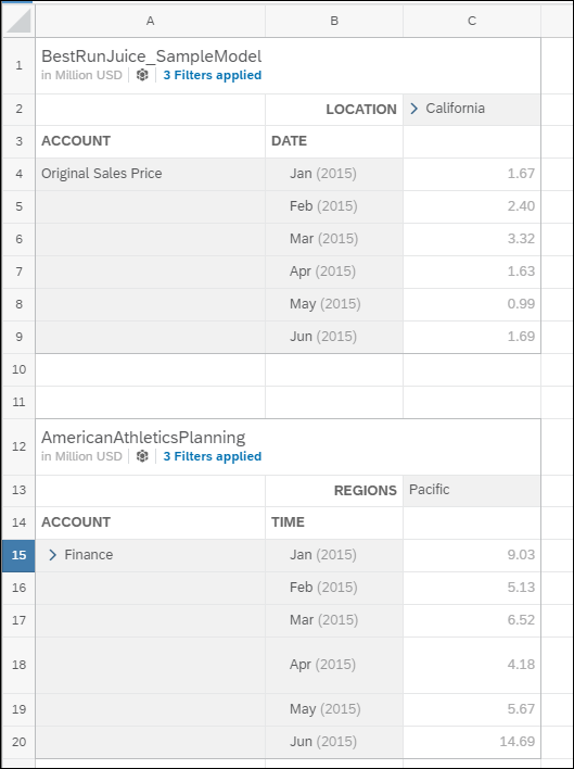
You're discussing purchases with your colleagues. Someone wonders if there's a way to show the combined sales per month for dissimilar products.
You create a grid page in your story and add two models to it: drinks and athletic gear. You limit both models to the same time period (first half of 2015, all months) and to one specific part of the country.
How to Create A Custom Calculation
You need at least two data sources or models in your story.
-
Add a grid page.
-
For each model in your story, add a table to the grid page.
Expand your tables so that you can see the cells that you want to use for the formula.

-
Select an empty cell in the grid.
Type in your formula.
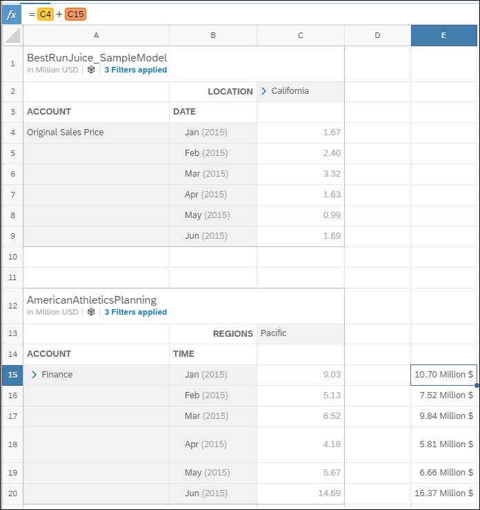
Add together the total sales for both products for each month: =C4+C15
Copy the formula to the remaining monthly cells.

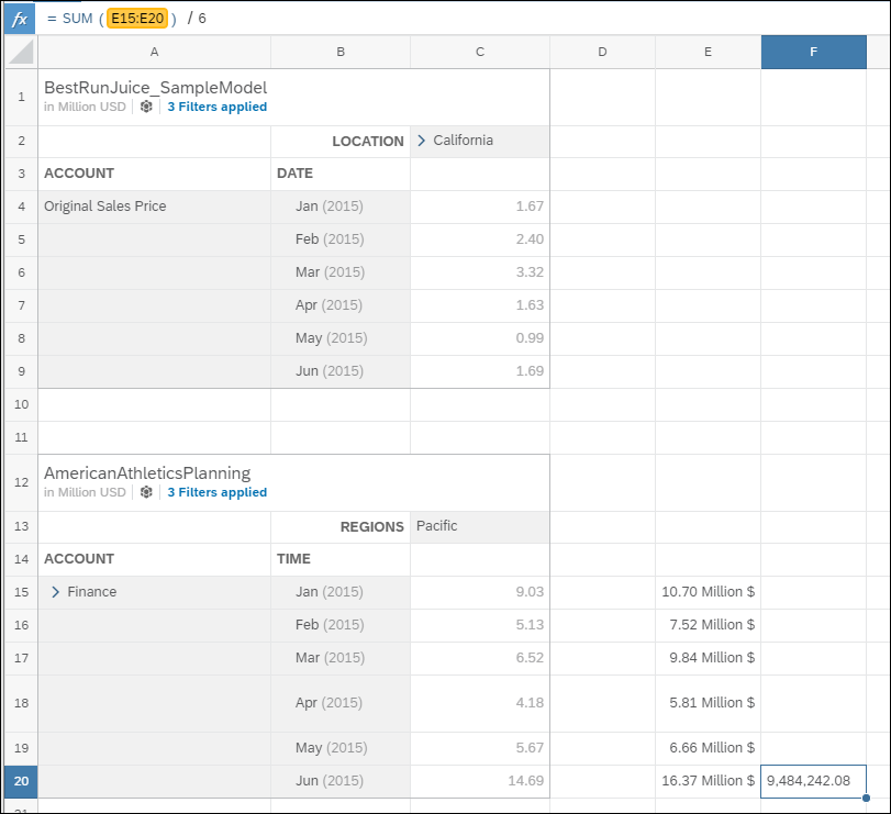
(Optional) Calculate the average sales per month: =sum(E15:E20)/6

When you select one of the calculation cells, the value for the formula is displayed.


 (More Actions)
 Add lane
 (Edit Styling)