Predicted vs. Actual
Quickly identify the predictive model errors thanks to the Predicted vs. Actual chart.
This chart shows the accuracy of your predictive model. It displays the actual target value as a function of the prediction.
How does Smart Predict compute the graph?
During the training phase, predictions are calculated using the training data source.
To build the graph, Smart Predict groups these predictions on 20 segments (or bins). Each segment represents roughly 5% of the population.
- the mean of the predictions on each segment (Segment Mean)
- the mean of the actual target values (Target Mean)
- the variance of this target within each segment (Target Variance)
How to read the chart?
- The Validation - Actual curve shows the actual target values as a function of the predictions.
- The hypothetical Perfect Model curve shows that all the predictions are equal to the actual values.
- The Validation - Error Min and Validation - Error Max curves show the range for the actual target values.
For each curve, a dot on the graph corresponds to the segment mean on the X-Axis, and the target mean on th Y-axis.
The area between the Error Max and Error Min represents the possible deviation of your current predictive model: It's the confidence interval around the predictions.
What can the chart tell you about your predictive model's accuracy?
You can draw three main conclusions from your Predicted vs. Actual chart depending on the relative positions of the curves on the graph:
- The Validation and Perfect Model curves don't
match.
Your predictive model isn't accurate. Confirm this conclusion by checking the prediction confidence indicators. If the indicators confirm your predictive model isn't reliable, you can improve its accuracy by adding more observations or influencers to your training data source.
- The Validation and Perfect Model curves match
closely.
Your predictive model is accurate. Confirm this conclusion by checking the predictive confidence indicators. If the indicators confirm its reliability, you can trust your predictive model and use its predictions.
- The Validation and Perfect Model curves match
closely but diverge significantly on a segment.
Your predictive model is accurate, but its performance is hindered in the diverging segment. Confirm this conclusion by checking the predictive confidence indicators. If the indicators confirm its overall reliability, you can improve that segment's predictions by adding more observations or influencers to it in your training data source.
If your Predicted vs. Actual chart is between any of these three cases, the prediction confidence indicators remains the best way to assess your predictive model's accuracy.
The predictive model
debrief displays the following Predicted vs. Actual
graph: 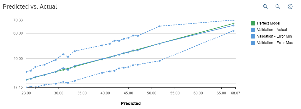
In our example, when the prediction (in blue) is 45 years old, the actual value ("validation value" taken from our historical data) is 44.75 years old. The error min and error max calculated by our predictive model are respectively 33.17 years old and 56.34 years old.
As you can see, the blue curve (our predictive model) and the green curve (the hypothetical perfect model) are very similar, then it means that you can rely on the predictions.