Explore the Data in a Story Shared with You
Use Explorer Mode to analyze the data in a story, see default views set by the story owner, or add and save additional views.
You can analyze every dimension or KPI in the story that is not restricted by the story owner, view the data in other chart types or tables, see default views set by the story owner, or add and save additional views.
Access Explorer Mode
On the story toolbar, select  (Explorer View
Mode).
If some explorer views have been added to a chart, the chart's subtitle will
contain the amount of available views. Simply click on the link  to
access the view.
To switch back to the story view, select  (Story View
Mode).
Navigating Explorer Views
The Explorer can contain multiple views that you can navigate as you do with story pages.

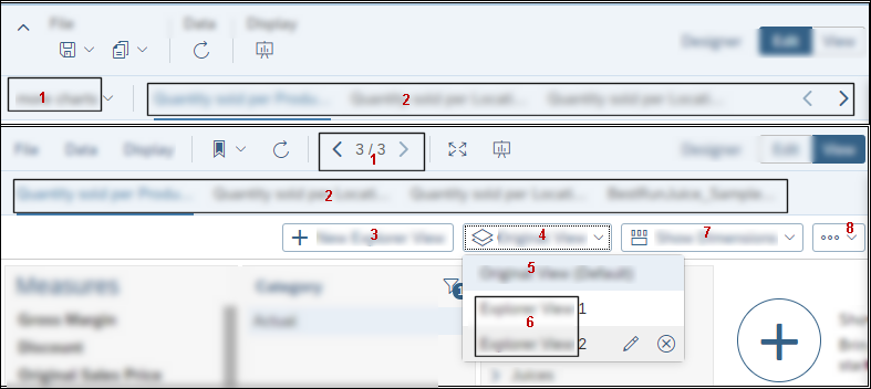
The following actions can be performed in the Explorer view (refer to the diagram):
-
Change to a different page. In Edit mode, you select the pages from a drop list. In View mode, you can use the left or right arrow keys to switch pages.
-
The tabs represent each chart or table widget that can be viewed in the explorer.
-
Create new views by clicking + New Explorer View.
-
After you create a new view, that view label is displayed. Select the drop list icon to change to a different view.
-
The original view is first in the list (Original View), and it can't be renamed.
-
The other views can be edited (
 ) or deleted.
When you are in the Edit View dialog, you can change the name, and you can also set the view as the default view for the widget (select Set view for explorer default.). After you close the dialog you will see that (Default) has been appended to your new default view.
The next time you open Explorer, the selected view will open instead of the Original View.
-
Show Dimensions: You can add more dimensions to the facet panel to use in your exploration.
NoteIf you want to add all the dimensions to the facet panel (Show All) and there are more than 20 dimensions, it may take a little time to load all the dimensions.
-
 Sort Facets: The Sort Facets
dialog provides another way to show extra dimensions.
Sort Facets: The Sort Facets
dialog provides another way to show extra dimensions.-
In the dialog, either use Sort Options to sort all facets into ascending or descending order, or manually drag the facets to create a new custom order.
-
When you are satisfied with the order of the facets, select OK.
-
Explore Your Data
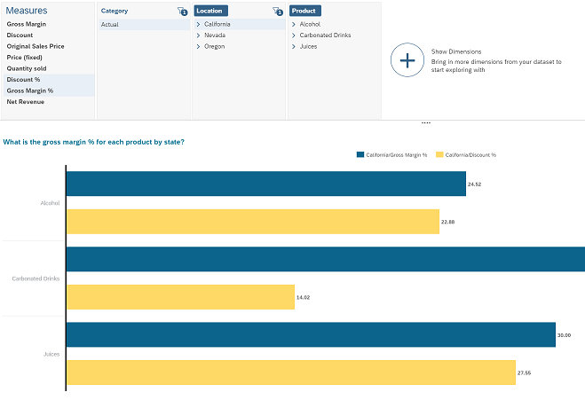
When you select measures and dimensions in the upper pane, the visualization in the lower pane updates in real time. You can filter dimensions by selecting individual members, and the visualization changes immediately to show you the filtered result.
For example, you can click on the Discount % measure to enable it in the chart, then click on California from the Location dimension to filter the results and only show the state.

To remove a measure or dimension from the chart, click on it again.
-
Click the dimension header to enable or disable it in the visualization.
-
Click a dimension member to apply or remove a filter on this element.
-
Click Access Other Interactions
 to open a context menu and do the following:
 - Select a hierarchy (if available)
- Change the sort order
- Select display options
Select a Visualization Type
The visualization type is chosen automatically based on the selected data, but you can change it to any of the types supported for your data.
To change the type of visualization, click the label on the top right corner of the lower pane and select a different type of chart or table.
For example, you can change the chart to a Stacked Bar/Column.
For more information, see Choosing the Best Chart Type for the Data.
Customize Your Chart with the Builder and Refresh your Data
In addition to changing the type of visualization, you can also automatically or manually refresh the data in the visualization and open the chart Builder to build and customize your chart.
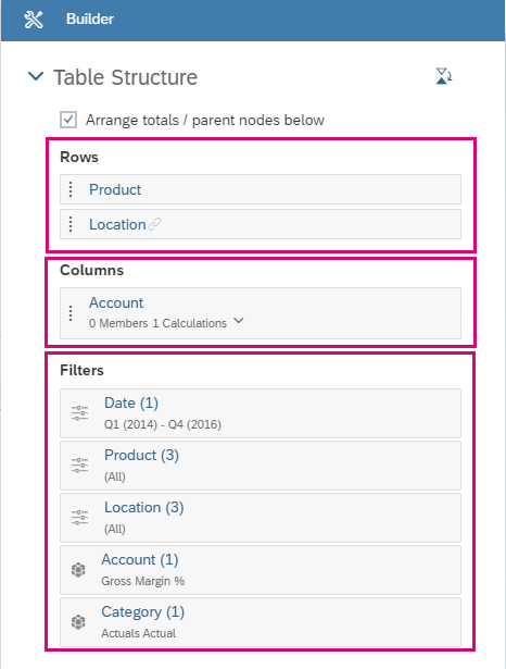
The Builder can help you switch dimensions and add or remove filters easily. Drag and drop dimensions, measures, or filters and the visualization will be updated.
Explore Tables
-
Show/Hide- click the
 menu and then Show/Hide to show or hide the elements
in a table.
menu and then Show/Hide to show or hide the elements
in a table.This way you can control which information is displayed. For example, you can choose to hide Dimension Headers.
-
Set Drillstate- set the drill level or drill state of the whole table content using the context menu and choosing the Dimension and Drill Level.
-
Edit Drill Limitation - When there are too many rows in your table only 500 are displayed and you get a warning. You can click on the icon and then Edit Drill Limitation to increase the table size. Keep in mind that when you increase the number of rows the number of columns will decrease to preserve the recommended limit.
Tips and Best Practices
-
Hide all the dimensions and only add the ones you require for your visualization. This improves performance in navigation.
-
Use the Builder to refine the Visualization. You can more easily build charts with multiple dimensions and tables using the builder. For example, in a table you can move dimensions to rows, columns, or filters.

-
Save your view in a bookmark
Create a new view by clicking + New View and Edit to give your view a new name. Then, click
 (Story View Mode) to
leave the Explorer and save your story in a bookmark
  .
. The Explorer view will be available directly after loading your bookmark.
-
You can export the data to Excel or CSV by clicking Export.