Viewing Stories on Mobile
Learn how to view and interact with your stories in the SAP Analytics Cloud iOS and Android mobile apps.
-
The Home tab contains your favorite and featured content, as well as recently viewed items.
- The Files tab displays all the folders and files containing stories
and presentations enabled for mobile.NoteYou can also use the search tool provided on the Home and Files tabs to find your story.
 Stories to choose a story you want to view. You can view stories
you own, stories shared with you by others, and public stories all from your mobile
device.
Stories to choose a story you want to view. You can view stories
you own, stories shared with you by others, and public stories all from your mobile
device.For stories with multiple pages, swipe left to go the next page and
swipe right to go the previous page by tapping the page title  at the top of
the screen. This brings up a dialog where you can jump directly to any page.
Story, Page, and Other filters
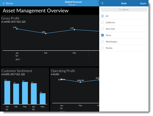
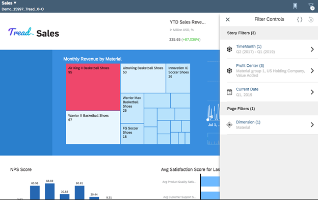
Story filters, page filters, model and dimension filters, and calculations that exist in the story can be interacted with in the Input Controls panel of the mobile app.
- While viewing a story, tap
 (found in the upper right part of your screen).
 - In the Input Controls panel, you'll see a list of filters (calculations appear under Others). Select a filter.
- In the panel for the selected filter, you can see a list of all possible filter values. Select one or multiple values by tapping the check box next to each value.
- (Optional) If the dimension contains a hierarchy, you can select the dimension to see the next level of dimension values and select one or more of the child values.
- Tap Apply and the story will refresh with your changes.


Chart Filters and the Quick Actions Menu
 in the upper right corner of a
chart to expand it full screen. Initially the menu shows several chart-wide options,
but more options become available after selecting a value in the chart. Select a
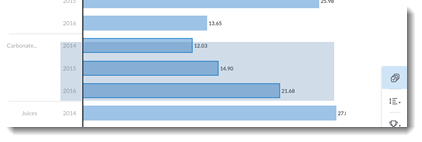
value in a chart by tapping it, such as a bar in a bar chart, to see the full list
of options.
in the upper right corner of a
chart to expand it full screen. Initially the menu shows several chart-wide options,
but more options become available after selecting a value in the chart. Select a
value in a chart by tapping it, such as a bar in a bar chart, to see the full list
of options.| Option | Description |
|---|---|
 |
Tap to enable multi-selection of chart values. For example, enabling this option allows you to tap and select more than one bar in a bar chart before applying a filter. When this option is enabled, you can also tap and drag to lasso multiple values in a given area.  When disabled, you can only select a single value at a time. Tapping a new value changes the selection. |
 |
Sort the measures and dimensions in charts in ascending or descending order. For example, sort dimension values from A-Z or Z-A, or measure values from lowest to highest or highest to lowest. |
 |
Filter data by the ranking of the highest or lowest values. For example, show only the Top 5 or Bottom 5 measure values. Custom Top N options saved to the original story are applied when viewing in the mobile app. |
 |
Filter by (include) the selected values. Tap To remove
a chart filter, select  Note If
using the Android App, you cannot remove the chart filter.
You can only reset the chart filter. |
 |
Filter out (exclude) the selected values. Tap To remove
a chart filter, select  Note If
using the Android App, you cannot remove the chart filter.
You can only reset the chart filter. |
 |
Drill down through a hierarchical dimension. For example, assume you have a hierarchy for a Location dimension that consists of Country > State > City. If your chart is displaying at the State level, tap a value to select it, and then tap to drill down one level. The chart refreshes and now displays values at the City level. |
 |
Drill up through a hierarchical dimension. For example, assume you have a hierarchy for a Location dimension that consists of Country > State > City. If your chart is displaying at the City level, tap a value to select it, and then tap to drill up one level. The chart refreshes and now displays values at the State level. |
 |
Apply an axis break to outlier values in bar, column, or waterfall charts. For example, let's say you have two values in a bar chart
much larger than the rest. These two values determine the
scale of the chart, and make it harder to read smaller
values. Tap |
 |
(Beta) Add a datapoint to your Watchlist. This icon is
displayed when you select a datapoint in a chart.
Note Currently, only selected Beta customers can use this
feature. If you are interested in the Beta program, please
contact your SAP account manager. Please note that the
following conditions apply during the Beta period: Your
company acknowledges that the software is a preliminary
version and not subject to any productive use license
agreement or any other agreement with SAP. SAP has no
obligation to include or remove any functionality from the
software in any future version or in any SAP standard
product. |
 |
Open a chart link to other stories, story pages, external web pages, and links that launch other apps. |
Additional Chart Interactions
| Option | Description |
|---|---|
| Change chart value details. |
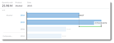
Tap and hold on a single value, then drag across other values. The chart summary changes to show details for each highlighted value as you drag across the chart. |
| Show a changing difference marker. | Tap and hold to select a single value, then select a second value. A changing difference marker is displayed on the chart showing the absolute and percentage difference between the two values.  |


