Getting Started with SAP Analytics Cloud Stories
Learn about SAP Analytics Cloud stories and create a sample story.
How to Create a Sample Story
- Import and set up data into a new story
- Explore your data interactively
- Create a story page with visualizations
- Customize the items on the page with formatting and filters
- Pin the story to your Home screen, and share it with others
- Discover additional help resources
What is a Story?
Stories are at the center of the SAP Analytics Cloud experience. They let you explore data interactively to find insights, visualize information with charts and tables, and share, present, and comment on your findings with colleagues. Before you get started, it's helpful to know a few basic things.
-
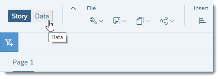
A Data view where you can explore data in real-time, with dynamic visualizations changing on-the-fly.
-
A Story view where you can design beautiful, interactive dashboards for yourself or others.
You can create new pages and add items such as charts, tables, and other graphics that visualize your data. Items on a page, such as a bar chart, are arranged as tiles that you can move around, resize, and style to your liking.
What are models, datasets, dimensions, measures, and accounts?
-
Measures (or Accounts in planning models) represent quantities that provide meaning to your data. For example, sales revenue, salary, or number of employees.
-
Dimensions represent categories that provide perspective on your data. For example, product category, date, or location.
Together, they are the framework for viewing data in interesting ways, whether it be a trend line of revenue over time, or a comparison of gross margin across different regions.
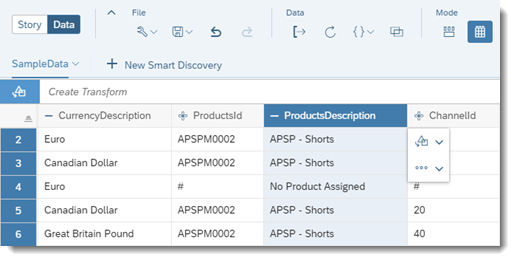
Dimensions contain attributes – think of them as columns in a dimension table. For example, a product dimension's attributes could include an ID and description.
Looking for a deeper dive on models? If so, see Learn About Models.
Or are you more interested in datasets? If so, see About Datasets and Dataset Types.
Now that you know a bit about stories, models, and datasets, let's get started!
Import and Set up Your Data
With SAP Analytics Cloud, you can bring in data from a wide variety of cloud-based and local data sources. For this guide, let's use a simple CSV file containing revenue and expenses for a set of products in a fictional company.
Download the CSV file here to follow along (unzip to find SampleData.zip and then unzip again).
Let's begin from the Home screen and import the sample data.
Import Your Data
-
From the (
 ) Main
Menu, select
  Home.
Home. -
From your computer, drag your file over to the Home screen in SAP Analytics Cloud. Release it on the Prepare Dataset option when the pop-up appears.
NoteI'm Feeling Lucky automatically maps the column data to measures or dimensions, and dives right into the Data Exploration mode (
 ). You can
always change this model.
). You can
always change this model.After the data is loaded into a model, you'll see the Data Manipulation view in your newly created story.
Your column data has automatically been mapped to measures and dimensions. In our sample data, the column Value should be a measure, identified by the icon
 , and the other
columns should be set to dimensions identified with the
  icon. Let's make some changes.Tip
If the data was imported as agile data instead of basic data, the dimensions won't have the
 icon.
icon.To change to using basic data preparation, select .
Change the TimeMonth column from a generic dimension to a date:
Select the TimeMonth column heading to highlight it, and then in the Details panel on the right select the Type drop-down list and choose Date.
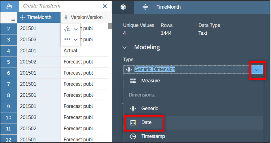
Now select the Enable date drill down checkbox to create a date hierarchy. This allows you to view your data in a time-series chart.
Define description columns as attributes of related ID dimensions:
In our sample data, most other columns are pairs of ID and description columns. For example, there are ProductsId and ProductsDescription columns. You can define the description columns as a description of their ID dimension, rather than as a separate dimension.
Select the ProductsId column heading to highlight it, and then in the Details panel on the right select . Choose ProductsDescription from the drop-down list.
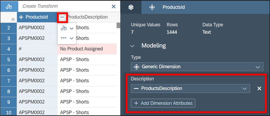
Note that the icon next to the ProductDescription column has changed to indicate it is no longer a dimension. Repeat these steps for AccountID/AccountDescription, RegionId/RegionDescription, CurrencyId/CurrencyDescription, and ChannelId/ChannelDescription.
-
Choose
 on the
Details panel to switch to an overview of the
data as a whole. Review the Model Requirements
section to confirm that mapping is complete and that no data quality
issues are detected.
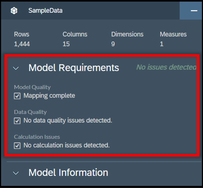 The Details panel also shows how many rows of data are being imported
 -
Save your changes by selecting to generate the model in the story with your data.
Now that the model is saved and your data imported, let's start exploring your data.
Explore Your Data
Select  (Data Exploration) from the Mode
section of the toolbar.
In the Data view, charts are auto-suggested as you select and deselect measures and dimensions:
Select Show Dimensions in the facet panel and choose AccountId, ProductsId, RegionId, and TimeMonth.

-
Select the Value measure and REVENUE from the AccountId dimension.
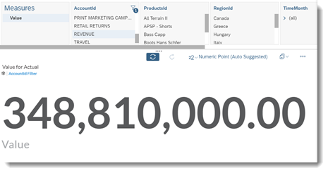 A numeric point chart is displayed showing the sum of all revenue values
 -
Now select the ProductsId dimension.
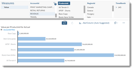 The visualization switches to a bar chart dividing revenue by product
 -
In the Display section of the toolbar, you can show or hide dimensions from the
 (Show or
Hide) menu. Select CurrencyId to show this
dimension and de-select TimeMonth and
RegionId to hide them.
 -
Now select CurrencyId in the facet panel to change the suggested chart again.
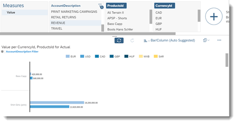 The bar chart now shows the revenue by currency
If you don't like the chart that is suggested, you can manually select the chart type instead:
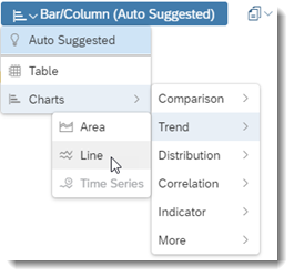
Try it for yourself! The Data view allows you to explore insights into your data at your own pace.
Create a New Story Page
The Data view is a good way to get quick insights into your data, but SAP Analytics Cloud provides a robust designer where you can build more permanent pages with visualizations and other interactive elements. To get started, select to copy your existing chart on the Data view to the first page of your story. Your view automatically switches to the Story view:
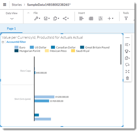
Let's add a table to the page that shows revenue breakdown over time.
-
From the Insert section of the toolbar, select
 (Table).
A table tile is added to the canvas that uses the sample data from your model. You can add additional rows and columns to populate the table.
-
Ensure the tile is selected on the canvas, and add measures and dimensions from the Builder panel:
-
Under , select + Add Measures/Dimensions and choose AccountId.
-
Under , select + Add Measures/Dimensions and choose TimeMonth and VersionCategory.
-
Resize it by selecting a corner of the tile and dragging to make it larger.
 Note
NoteYou can also reposition tiles by grabbing an edge and moving the tile around the canvas. Surrounding tiles on the page auto-arrange as needed.
The table now shows actuals and forecast values for the individual accounts. Select the arrow next to (all) to expand the TimeMonth dimension that was set up as a hierarchy earlier to see a more detailed breakdown by year, quarter, or month.
Change Styling and Apply Filters
The Canvas provides a variety of tools that let you control how the charts on your page behave and are displayed. Let's try a couple of these out.
Add a Chart Filter
Filters let you focus on a specific set of data. You can apply filters to an entire story, a single page, or a specific chart on a page. Let's add a currency filter that restricts the data for the entire story to show only US dollars.
-
Select
 (Story
Filter/Prompt) from the Tools
section of the toolbar.
(Story
Filter/Prompt) from the Tools
section of the toolbar.A filter bar appears under the toolbar.
-
Select
 (Add
Story Filter/Prompt) and choose from the drop-down list.
(Add
Story Filter/Prompt) and choose from the drop-down list.A dialog will appear allowing you to set a filter on this dimension.
NoteFor Trial users, the CurrencyId is directly accessible from the drop-down list. - Select US Dollar and then OK.
Both the chart and table in the story should refresh automatically to show only
US dollar values. The new filter is visible in the filter bar. 
Apply a Style Template
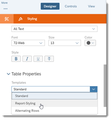
The Styling panel on the Canvas allows you to change the fonts, colors, and other styling attributes of tiles on your page. You can also make use of pre-configured style templates. Let's apply a Report-Styling template to the table and give it a different look.
-
Select the table tile on the page so it is highlighted.
-
From the Designer panel, select
 (Styling) to switch from the Builder panel to
the Styling panel.
 In the Table Properties area, select Report-Styling from the Templates drop-down list. Choose OK when prompted by the dialog.
Save Your Story and Share with Others
Now that you've created your story, select  (Save) to
save your changes.
Share Your Story
- From the toolbar, select .
- In the Share Story dialog, select
 (Add usernames or teams) and select a
colleague's username.
 - Set the Access value to View and choose Share.
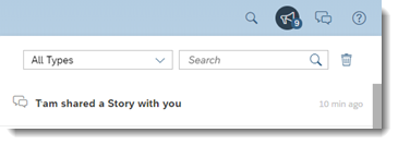
When your colleague logs on to SAP Analytics Cloud, they will see a notification containing a link to open your story and see what you've done.
Pin to Your Home Screen
You can also pin individual story tiles to your Home screen. Pin different story tiles to create a dashboard of important charts and other visualizations that you can view immediately after signing into SAP Analytics Cloud.
-
Select the chart tile on the page so it is highlighted.
- On the tile, select .
Go to the Home screen and you'll see the chart. You can resize and reposition the chart on the Home screen as you would on the story Canvas.
Additional Help Resources
Congratulations! You've created your first story. Take a look at the following resources to find out what else you can do.
-
Learn About Models: find more information on creating and using models.
-
Video Tutorials: watch our video tutorials to get started on additional topics.
-
What's New – 2023 Releases: keep tabs on updates to SAP Analytics Cloud.
-
Welcome to the SAP Analytics Cloud Help: search the SAP Analytics Cloud help to find step-by-step procedures on how to use the product.


 Add
Dimension Attributes
 Description

 Share
Share
 Pin to
Home