Chart Builder Panel Overview
The chart Builder panel in SAP Analytics Cloud provides features for working with data in your chart or customizing your chart’s appearance.
The chart  Builder panel is organized into different sections where you can configure your data source, choose your chart
type, add and remove dimensions, and so on.
Builder panel is organized into different sections where you can configure your data source, choose your chart
type, add and remove dimensions, and so on.
The following diagram displays the chart
Builder panel features available.
| Diagram | Legend |
|---|---|
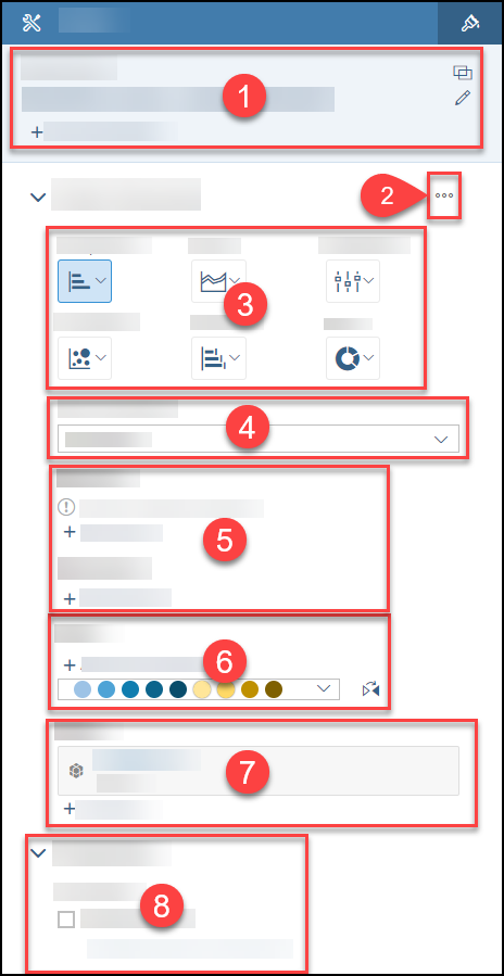 |
Data Source Information
Hovering over or selecting the data source name will show a tooltip with the data source description and file path.
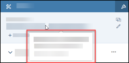
To
change the data source, choose the  (Change
Primary Model) button in the
Builder panel.
(Change
Primary Model) button in the
Builder panel.
You can create links between dimensions across models. To open the Link
Dimensions dialog, you can select  (Link Dimensions) or + Add Linked Models in the
Builder panel. For more information on linking dimensions, see Link Dimensions Across Multiple Models.
(Link Dimensions) or + Add Linked Models in the
Builder panel. For more information on linking dimensions, see Link Dimensions Across Multiple Models.
You can also open the Link Dimensions dialog through selecting (Link Dimensions) in the Data section of the
toolbar.
For more information on data sources, see About Adding Data to a Story.
Add or Remove Chart Components
If you select  (Add/Remove Chart Components) next to the Chart
Structure label, a dialog will open that lists the components you can add to your chart.
(Add/Remove Chart Components) next to the Chart
Structure label, a dialog will open that lists the components you can add to your chart.
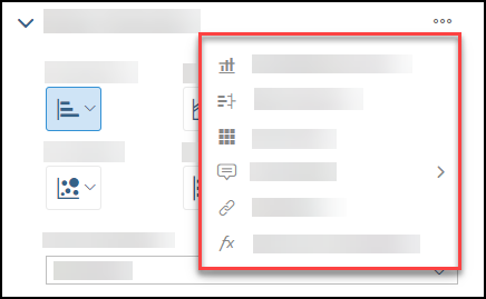
Depending on your selected chart type, the features that are available in the Add/Remove Chart Components dialog may vary.
-
 Add Reference Line: You can add reference lines to show important values in your chart. For more
information, see Add a Reference
Line.
Add Reference Line: You can add reference lines to show important values in your chart. For more
information, see Add a Reference
Line. -
 Add Variance: Adding a variance in your chart can show you the difference between versions of an
account or the difference between time periods. For more information, see Adding Variances to Charts.
Add Variance: Adding a variance in your chart can show you the difference between versions of an
account or the difference between time periods. For more information, see Adding Variances to Charts. -
 Add Trellis: Adding a trellis chart provides a grid of small charts for comparison. For more
information, see Use Trellis Charts for
Comparison.
Add Trellis: Adding a trellis chart provides a grid of small charts for comparison. For more
information, see Use Trellis Charts for
Comparison. -
 Add Tooltip: You can include additional information in your tooltips for measures or dimensions
that are not in your chart. (In this topic, accounts and measures are referred to as measures for most model types.) For
more information, see Include Extra Accounts,
Measures, and Dimensions in Tooltips.
Add Tooltip: You can include additional information in your tooltips for measures or dimensions
that are not in your chart. (In this topic, accounts and measures are referred to as measures for most model types.) For
more information, see Include Extra Accounts,
Measures, and Dimensions in Tooltips. -
 Hyperlink: You can add a hyperlink to another story or page, or to an external URL. For more
information, see Linking to Another Page, Story, or External URL.
Hyperlink: You can add a hyperlink to another story or page, or to an external URL. For more
information, see Linking to Another Page, Story, or External URL. -
 Add Cross Calculations: You can add cross calculations to your chart. For more information, see
Add Cross Calculations to Charts.
Add Cross Calculations: You can add cross calculations to your chart. For more information, see
Add Cross Calculations to Charts.
Chart Type Selection
The
Builder panel groups similar chart types together.
-
Comparison
-
Trend
-
Distribution
-
Correlation
-
Indicator
-
More
For more information on the chart type groups and the chart types that are included in each group, see Choosing the Best Chart Type for the Data.
Chart Orientation
For specific chart types, such as Bar/Column, Box Plot, Waterfall, and so on, you can change whether you want your chart to be displayed in a Vertical or Horizontal orientation.
Depending on your chart type, you may see other options such as Y Axes Overlap or Show Chart as 100%.
For more information, see Choosing the Best Chart Type for the Data.
Measures and Dimensions
When adding objects such as accounts, measures, or dimensions to
your chart using the
Builder panel, a dropdown menu appears. (In this topic, accounts and measures are referred to as measures for
most model types.)
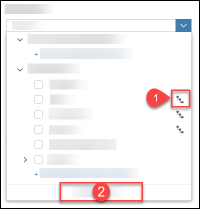
-
1) A dimension that has
 next to their name
is a hierarchical dimension. For more information about hierarchical data, see Work with Hierarchies in a Chart.
next to their name
is a hierarchical dimension. For more information about hierarchical data, see Work with Hierarchies in a Chart. -
2) To view objects in a panel instead of a dropdown menu, select Expand List in the dropdown menu.
-
Create a calculation by selecting + Create Calculation
-
Select measures that you want in your chart
-
Create a measure input control by selecting + Create Measure Input Control
-
Create a calculated dimension by selecting + Create Calculated Dimension
-
Select dimensions that you want in your chart
-
Create a dimension input control by selecting + Create Dimension Input Control
For more information on measures and dimensions, see Selecting Accounts, Measures, and Dimensions.
Color
In the Color section of the
Builder panel, you can assign colors for individual values, synchronize colors across charts, or change the
color palette for your charts.
For more information, see Changing Color Palettes and Synchronizing Colors Across Charts.
Filters
In the Filters section, you can create filters on your chart data. By choosing + Add Filters, you can select dimensions and create a filter.
Properties
In the Properties section, you can choose whether you want to Enable Explorer. If you enable Explorer, you can Configure Measures & Dimensions.
For more information on Explorer, see Explore Your Data.