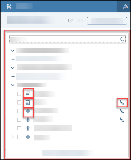
Chart Builder Panel in Optimized Design Experience
The chart Builder panel in SAP Analytics Cloud’s Optimized Design Experience provides features for working with data in your chart or customizing your chart’s appearance.
The chart  Builder panel is organized into different sections where you can configure your data source, choose your chart
type, add and remove dimensions, and so on.
Builder panel is organized into different sections where you can configure your data source, choose your chart
type, add and remove dimensions, and so on.
The following diagram displays the chart
Builder panel features available in Optimized Design Experience.
| Diagram | Legend |
|---|---|
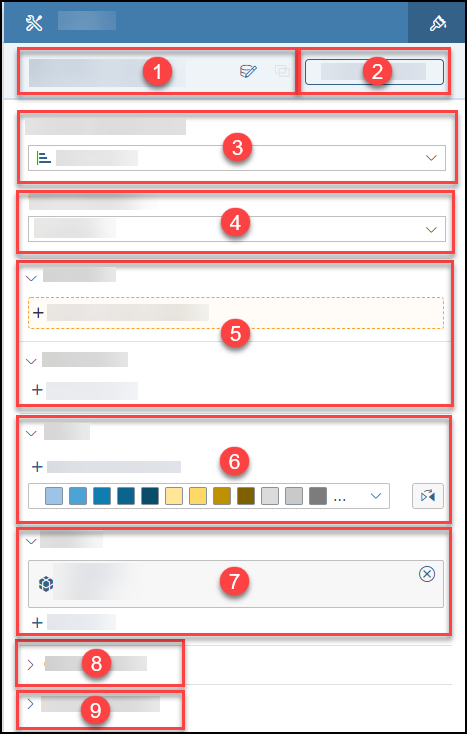 |
Data Source Information
In Optimized Design Experience, hovering over or selecting the data source name will show the Data Source ID and Last Updated information in a tooltip. The tooltip also displays the description and file path under Data Source Details.
To change the data source, choose the  (Select Model) button in the
Builder panel.
(Select Model) button in the
Builder panel.
 Blending is currently not supported in Optimized Design Experience.
The header section of the
Builder panel containing the data source information stays fixed at the top of the
Builder panel. Even as you scroll down the panel, you can still view this section at the top of it.
For more information on data sources, see About Adding Data to a Story.
Available Objects Panel
The Available Objects panel allows story designers to see all accounts/measures, calculations, input controls, and dimensions.
-
You can select the Available Objects button in the
Builder panel. -
You can select Open Available Objects in the dialog that appears in the
Builder panel when you are adding objects such as accounts, measures, or dimensions.
For more information on the Available Objects panel, see Available Objects Panel in Optimized Design Experience.
Currently Selected Chart
In Optimized Design Experience, there is a dropdown menu that
shows all the available chart types. This dropdown menu is found under Currently Selected Chart in the
Builder panel.
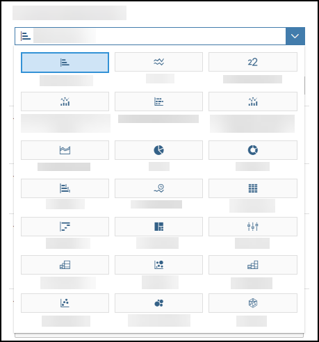
You can see the chart category (comparison, trend, distribution, correlation, indicator, more) in the tooltip that appears when you hover over a chart option in the dropdown. For more information on chart types, see Choosing the Best Chart Type for the Data.
Additionally, ghost charts, which are grayed out versions of the charts, display a visual representation of the selected chart type in the widget. The chart orientation is also reflected in the ghost chart.
You can see a ghost chart when you have a chart with no added measures.
Chart Orientation
For specific chart types, such as Bar/Column, Box Plot, Waterfall, and so on, you can change whether you want your chart to be displayed in a Vertical or Horizontal orientation.
Depending on your chart type, you may see other options such as Y Axes Overlap or Show Chart as 100%.
For more information, see Choosing the Best Chart Type for the Data.
Accounts and Dimensions
Required fields are highlighted with a color and dashed border in
the
Builder panel.
When adding objects such as accounts, measures, or dimensions to your chart using the
Builder panel, a dialog appears. (In this topic, accounts and measures are referred to as accounts.) The dialog
will open and expand to take up the height of the
Builder panel for better viewing.
-
 – Versions dimension
 -
 – Date dimension
 -
 – Generic dimension
 -
 – Hierarchical dimension
In the dialog and in the Available Objects panel, there are sections for account input controls, accounts, dimension input controls, dimensions, and calculations.
Terminology Improvements for Planning
With the support of planning-enabled models in the optimized design experience, the chart
Builder panel terminology has been updated to reflect more accurate and consistent terminology with the
Modeller.
The primary improvements are:
-
All account models (Classic Account Model, Model with Multiple Accounts) now show Accounts as the primary option for numeric values.
All models with measures (Model with Multiple Measures, Acquired Analytic or Live Model, Classic Measure Model) will continue to show Measure as the primary option for numeric values.
Hover tooltips in view mode will also reflect this terminology change.
Color
In the Color section of the
Builder panel, you can assign colors for individual values, synchronize colors across charts, or change the
color palette for your charts.
For more information, see Changing Color Palettes and Synchronizing Colors Across Charts.
Filters
In the Filters section, you can create filters on your chart data. By choosing + Add Filters, you can select dimensions and create a filter.
Chart Add-ons
The Chart Add-ons section lists configurations that you can add to your chart.
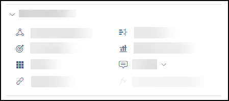
This section contains the following features:
Depending on your selected chart type, the features that are available in the Chart Add-ons section may vary.
-
 Linked Analysis: You can create a linked analysis to drill through hierarchical data or create filters
that simultaneously update multiple charts in your story. For more information, see Creating a Linked Analysis.
Linked Analysis: You can create a linked analysis to drill through hierarchical data or create filters
that simultaneously update multiple charts in your story. For more information, see Creating a Linked Analysis. -
 Variance: Adding a variance in your chart can show you the difference between versions of an account or
the difference between time periods. For more information, see Adding Variances to Charts.
Variance: Adding a variance in your chart can show you the difference between versions of an account or
the difference between time periods. For more information, see Adding Variances to Charts. -
 Threshold: You can add thresholds to your stories or individual accounts in a chart. For more
information, see Using Thresholds in Charts.
Threshold: You can add thresholds to your stories or individual accounts in a chart. For more
information, see Using Thresholds in Charts. -
 Reference Line: You can add reference lines to show important values in your chart. For more
information, see Add a Reference Line.
Reference Line: You can add reference lines to show important values in your chart. For more
information, see Add a Reference Line. -
 Trellis: Adding a trellis chart provides a grid of small charts for comparison. For more information,
see Use Trellis Charts for Comparison.
Trellis: Adding a trellis chart provides a grid of small charts for comparison. For more information,
see Use Trellis Charts for Comparison. -
 Tooltip: You can include additional information in your tooltips for accounts or dimensions that are
not in your chart. For more information, see Include Extra
Accounts, Measures, and Dimensions in Tooltips.
Tooltip: You can include additional information in your tooltips for accounts or dimensions that are
not in your chart. For more information, see Include Extra
Accounts, Measures, and Dimensions in Tooltips. -
 Hyperlink: You can add a hyperlink to another story or page, or to an external URL. For more
information, see Linking to Another Page, Story, or External URL.
Hyperlink: You can add a hyperlink to another story or page, or to an external URL. For more
information, see Linking to Another Page, Story, or External URL. -
 Cross Calculations: This feature is currently not supported in Optimized Design Experience.
Chart Properties
Zero Suppression
In the Chart Properties section, you choose whether you want to enable Zero Suppression. If you enable Zero Suppression, you can hide zero or null values in your selected chart.
Arrange Totals
By default in a new story, the totals data point is last in the chart.
You can choose to show the totals first, or to hide them.
Time Series Chart Properties
-
Under Initial Chart View, you can choose one of the following options:
-
Open in last saved view
-
Open in latest data
-
-
Under Time Axis Settings, you can select whether you want to Collapse dates with no data in your chart.
Waterfall Chart Properties
-
You can enable the Variance Waterfall option if you want to show comparison values between dimension members.
-
Under Waterfall expansion, you can select or deselect the following options:
-
Start first measure from the baseline
-
Place subtotal parent nodes first
-
Histogram Chart Properties
There is no Zero Suppression option for Histogram charts under the Chart Properties section.
-
Number of bins: You can use the slider or input a number to set the number of bins you would like for your Histogram.
-
Automatically Set Range of Values: You can toggle this option on or off.